The Hex Perplex
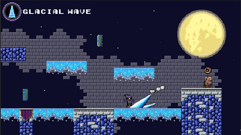
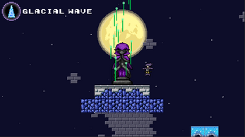
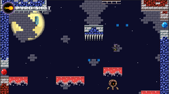
Welcome to the Hex Perplex! Can you defeat the unstoppable power that lurks among these walls? Master the power of the spell books and vanquish the curse that holds the castle! Use them to fight enemies and alter your terrain! It will surely be a difficult journey!
CONTROLS
| Action | Key |
| Run | [A] / [D] |
| Jump | [O] |
| Cast Spell | [P] |
| Pause | [Space] |
Any and all donations are much appreciated!
| Status | Released |
| Platforms | HTML5 |
| Rating | Rated 5.0 out of 5 stars (2 total ratings) |
| Authors | Daniel Narvaez, Queid504 |
| Genre | Platformer, Puzzle |
| Made with | Unity |
| Tags | 2D, Magic |
Development log
- Version 2.0 Release 01.24.2021Jan 24, 2021
- Official Release 01.18.2021Jan 18, 2021
- Playtesting & FeedbackOct 29, 2020
- Development ProcessOct 27, 2020


Comments
Log in with itch.io to leave a comment.
After a couple of levels, this is what I noticed.
The placement of the "Power up" to fire is pretty awkward in the early levels. It was pretty difficult.
Also, I don't know if this is something that was mentioned previously but it doesn't work on Safari MAC OS- wasn't moving past the loading screen.
It would be nice if it told you what level you were up to on top of the screen.
I'm looking forward to seeing your further development of the game. Overall it's fun!
Well, after doing a quick playthrough of the new version after experiencing the original Hex Perplex, I must say I am somehow more frustrated then I ever was with the first Version. But it wasn't in the "Man, this makes me want to beat it more because its a challenge" more "man, I wanna use my belt to hang myself cause the janky mechanics." While I enjoyed some changes, mainly the upside down mechanics and the more aggressive enemy A.I, being forced to return to the books every time you make a mistake, or just to recharge and re-experiment with the possible answer to these puzzles is both frustrating and brainless. Other then the mechanics, there are plenty of Quality of life changes that would make this game bearable, Enemies that can fire projectiles don't reset their charge periods when you lose Aggro, nor do they recharge when you die. Leading to inconsistent runs where I have to gamble whether or not ill die instantly upon getting close. The Glacial Ice requiring room in front of you to cast has cucked me from victory too many times to count, especially since I need to use it on small platforms where I barely have the room. And finally, the Dash, T h e D a s h. unintuitive, annoying to use and leads me to charge into my death headfirst more often then not, Trying to dash upwards is about as intuitive as using a rock to dig a hole. You have no Momentum when moving any direction after going upwards. Not to mention that enemies still retain their hit frames during their death animation, leading to me dying right after killing a enemy since they charged right into my spell, died, then hit me. I thought it couldn't get any worse, until I released that the final level would have every one of these problems at the same time and then some, Blind leaps to try and hit a orb that we cant see, all with the spikes rising up slowly but surely. Half the orbs I cant see until I pass them, making it so I have to suicide jump multiple times to learn their EXACT locations just to have a chance at completing, only to be cucked by one of the afore mentioned problems and glitches. All in all, I wont even bother giving a rating, this qualifies more as a glorified tech demo to show a proof of concept rather then a decent flash game. Everything about this game is Frustrating and makes me appreciate games that look worse, but play loads better. TLDR, Bad game, fix that shit
This was a really fun game to play! I thought the mechanics were very fun, and I was excited to hear you guys plan on developing this further on your own time.
I think one of the best parts about this game is the visual aspect along with the mechanics. It feels and looks like a totally classic platformer, and reminds me of the dungeon levels in classic Mario games. Overall, very successful iteration of a platformer. And the color theming was great as well!
Definitely one of the more difficult platformers we've playtested. I would recommend toning down the difficulty just a bit in the later levels. I think with a little more tweaking and you would have yourself an excellent game. As usual, the art is great like in your other games. The level difficulty is easy to follow and gets progressively harder. I think you mentioned that you would continue to work on the game. I look forward to seeing more.
This game is very stylized and coherent to its gameplay experience. The overall visual designs goes very correspondent to the level design of the game, which that there are no extra and abundant assets that can impose as obstructions to the players. The difficulty progression in this game is interesting. The obstacles in the game are well instructed to the players. Splendid job on implementing checkpoints in the game to ensure a smooth and progressive gameplay experience that constantly encourages the players to continue rather than restarting over with frustrations.
This game works so well! With so many mechanics, the fluidity of each move working together shows the polish that went into development. The level design is clever, despite my troubles with the moving platform at the start of the 3rd level and the infamous moving ice-spike blocks. Smoothing over these bumps in difficulty would make this game have a super nice feel for progression along side difficulty. Each checkpoint felt really nice to reach, so that is evidence a lot of the levels are at a nice place in terms in difficulty. The movement abilities that also serve as attacks are a good idea, it allows for a faster-paced experience for anyone who wants to master this game. Good job guys!
Hex Perplex is really wonderful- it plays like a dream. I think what I enjoyed the most was the fact that you had a tutorial level, that allows the player to experiment with movement and navigation of the level itself. I think that it’s a great way to teach your player how the game works without overwhelming them with a wall of text. However, I may not be the best to critique this game, as I’m not one to play games that lean closer into the masocore genre, but the difficulty curve feels a little steep at times. Overall, Hex Perplex was really quite fun, and I enjoyed playing it a lot!
Playtester Name: Chang
Developer Name(s): Daniel & David
Playtest Date : 10/ 30
What were your favorite moments of the game?
- I have cleared all stages! It took me about 20 minutes and I really enjoyed it. The part I liked the most was when I found the checkpoint ! And I feel the most joy when I pass the obstacles at once.
Where do you see room for improvement?
- I had a hard time when I tried to kill enemies on a small platform. Even though I succeeded to kill I died right after because mostly I fell down and was killed by spikes. If check points didn’t save me from killing the enemy, this game would be much harder. Other than this, it was so good. The difficulty was suitable for me because I used to play difficult games such as Super Meat Boy, and Cuphead.
When did you stop playing and why?
- I stopped at the tutorial stage. I didn’t know what to do with the sphere.Other then this everything was clear!
What was confusing or intuitive about the interface or controls?
- Everything was clear.
What was confusing or intuitive about the game mechanics?
- I thought it would be great if the game had some text that explains how the mechanic interacts with the sphere. The mechanic itself and the level design using it was a completely brilliant idea.
What was frustrating or imaginative about the visual art, or sound design?
- There was no sound. I liked the color selection considering the mechanics. Fireball and Dash effects are awesome, too. They are well animated
Do you have any other feedback that you would like the designer to hear?
- It was so nice to have a check point, and I think it is an essential element in these games.
The art and mechanics in this game work together extremely well! I especially love the look and feel of the lightning dash. I really like how you created three simple mechanics that are easy to pick up but then forced players into difficult scenarios where the mechanics would be hard to master. I agree with the feedback you received in class that the difficulty is a bit steep at times but it's also kind of fun in that way. I like when people can come together and talk about their shared experience of not being able to pass a certain section until their fifth try. I like what Jason said about creating more condensed levels which very clearly incorporated all three mechanics. I really like the idea of giving players the chance to plan out their pathing and strategy before tackling the obstacles much like you did in the L shaped spike level.
Nice game. It worked very well, the controls were nice, the level difficulty increased as I went along. Then, I couldn't get past level 4! Definitely could have used a respawn point after the double wall of death. The colored orbs were a nice touch, though difficult to master the different colors. My fingers hurt from trying level 4 so many times. I really tried at least 1,000 times!
>What were your favorite moments of the game?
This game was fantastic! The levels just all around seem to be really cleverly designed, and some of the puzzles are great. Simple things like shooting into the crevice (in level 2?), and in general the timing and flow of the jumps is amazing.
Following from that, the core mechanic itself is really nice! Simple and intuitive but with a lot of room for great design, which I think you guys executed on well!
The art style is also fantastic; really clear and readable, and the crispness of it makes judging the jumps really intuitive. The color coding is also just really clever and I think works really well!
Also just wanna call out the respawn system! Dying without reloading the level, with the camera zipping you back feels really nice and polished.
>Where do you see room for improvement?
This might very well have been my own problem (maybe I installed it wrong?) but there wasn’t any sound, which was a bit surprising given the polish of everything else.
I think having enemies respawn after each death might be helpful too, mostly because it contributes to the difficulty curve really climbing, which I’ll get into below.
>When did you stop playing and why?
I think it’s level 4! I got a few tiers up but couldn’t beat it The one with the two moving blue spikey platforms you have to get past. I tried it for about 15 minutes and it was really fun (I might go back and try again after class, I really loved this game); I’m sure I can get past it eventually. But the difficulty curve jumped hugely at this point; every missed jump meant instant death, and being sent back down like 3 levels.
Thinking about it though, I’m not sure it’s actually that much harder than the earlier ones on a first run through--it’s just that for the previous levels, each time you die, the enemies you cleared out stay cleared out, so when you run through afterward you’re just going through an empty level. On this one, the instant death spike platforms are there every time, which made it feel massively more punishing.
>What was confusing or intuitive about the interface or controls?
This was all great!
>What was confusing or intuitive about the game mechanics?
I think this was all really clear.
>What was frustrating or imaginative about the visual art, or sound design?
Well I can’t really comment on the sound, but the art was fantastic! It feels slick and polished--I love the little animations when you die or destroy things. The grid based style is really helpful for this kind of game too and I love the aesthetic.
>Do you have any other feedback that you would like the designer to hear?
I think this is already a really great game! I’ll be going back and trying to beat the entire thing, and I’d love to see more levels in this style.
10/10, Best game ever, if i had a nickle for every good game ive played, id get my first nickle